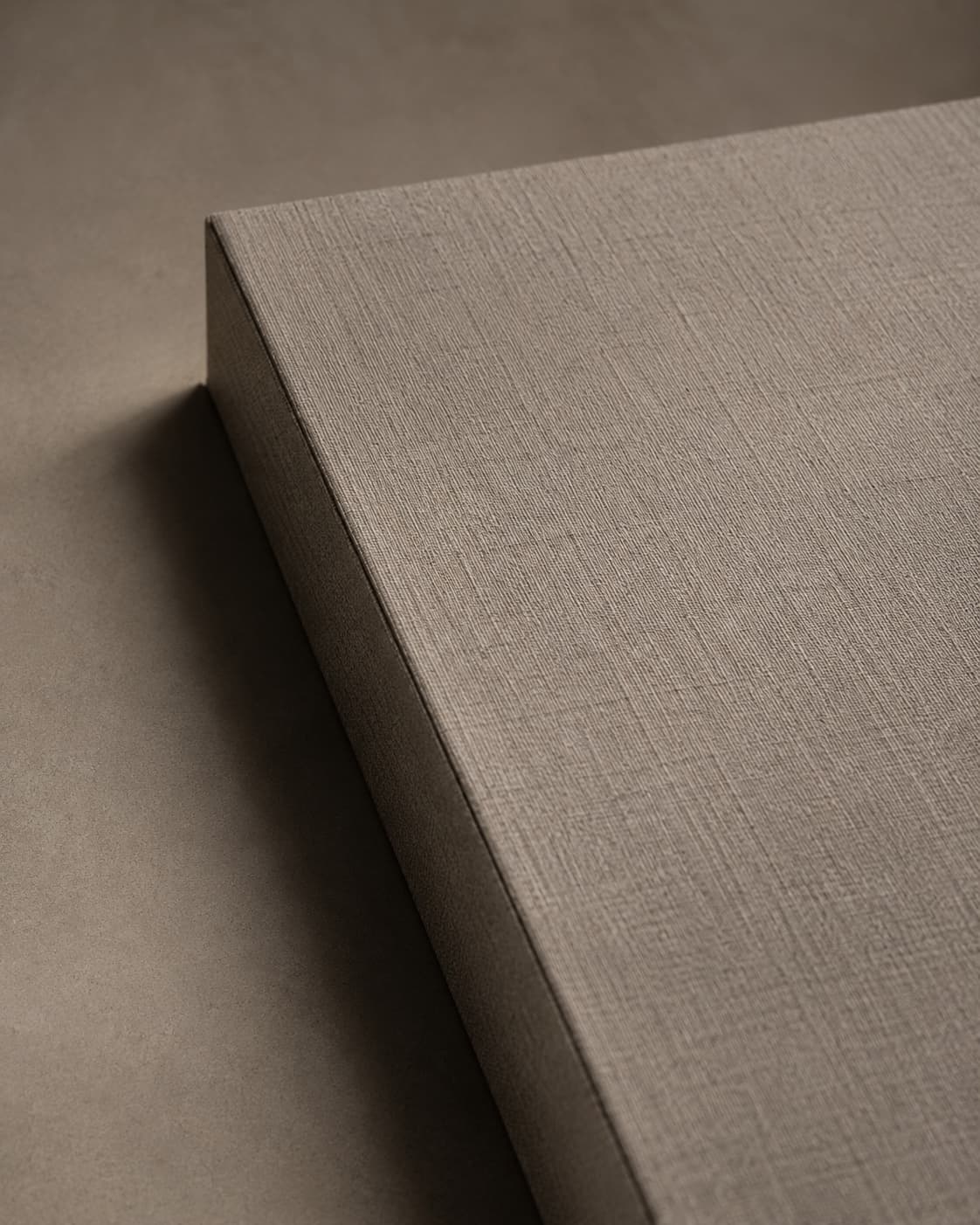
Colour and weight are the first things most people specify when choosing paper — but texture and finish are what a person actually notices when they pick something up. A subtle change in surface can shift a piece from "printed" to "crafted."
Common textures
- Linen — a fine woven pattern, classic for stationery and certificates
- Hammer / hammered — an irregular, dimpled surface with an artisanal feel
- Felt — a soft, slightly fibrous surface with gentle texture, popular for invitations
- Laid — fine parallel lines running through the sheet, a traditional writing-paper texture
- Smooth / wove — an even, uniform surface with no visible texture, letting colour and print take centre stage
Common finishes
- Matte — a non-reflective surface that reads as understated and premium
- Gloss — a reflective, high-shine surface that makes colours look vivid and saturated
- Metallic / pearl — a shimmering surface with a shifting sheen, used for standout labels and packaging
- Uncoated — a natural, paper-like surface with soft ink absorption, often chosen for a warmer, tactile look
Matching texture to the job
For fine stationery and invitations, a textured, uncoated stock (linen or felt) tends to feel the most considered — it holds foil and letterpress beautifully. For packaging and labels that need to catch the eye on a shelf, metallics and glossy coatings do more visual work. For anything with dense photography or fine detail, a smooth or lightly textured surface keeps the printed image sharp rather than competing with the paper's own pattern.
Texture and finish are hard to judge from a screen — we'd always recommend requesting a physical swatch before finalising a specification, especially for foil, letterpress or metallic work where the paper's surface directly affects the result.